This is what we build for plumbers
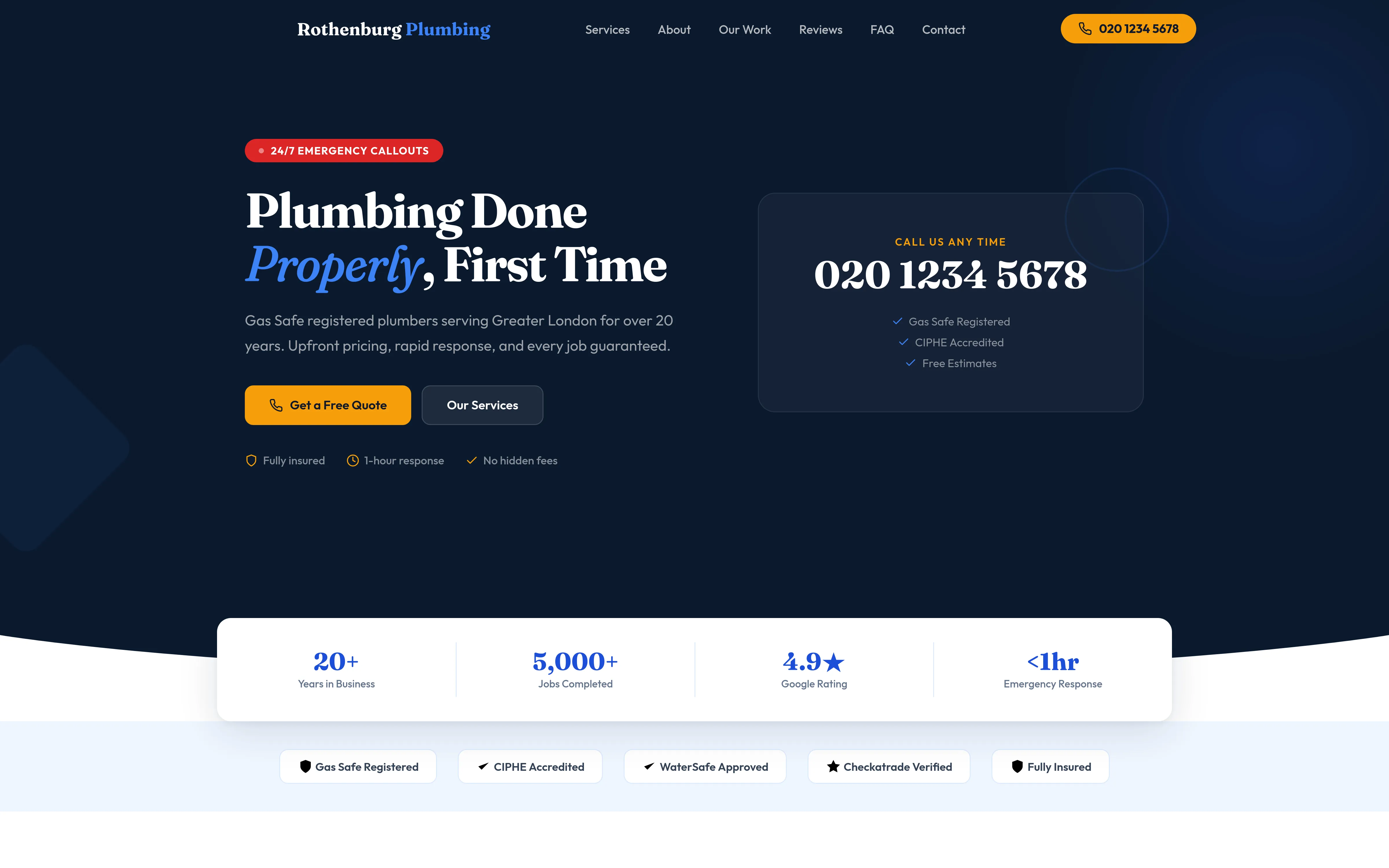
This is a demo — a live example of the kind of site we build for plumbing companies. Click through it, scroll around, see how it feels. It's not a concept or a mockup. It's a real, working site you can hand to a plumber tomorrow and they're in business.
The thinking behind it is simple: most people will look at the top of a site and leave. So everything a customer needs is right there in the header — the phone number, the emergency badge, the trust signals. If they never scroll, they can still call.
The header does the heavy lifting
Someone's got a burst pipe. They're panicking. They Google "plumber near me" and land on this site. What do they see?
- A massive phone number — not in the footer, not on a contact page. Right there, in a card, with trust badges underneath. One tap and they're calling. The site's entire job is done in three seconds.
- "24/7 Emergency Callouts" badge — bright red, top of the page, before anything else. A panicking customer needs to know you're available now. Not tomorrow. Now.
- Trust signals — Gas Safe Registered, CIPHE Accredited, WaterSafe Approved, Checkatrade Verified, Fully Insured. All visible without scrolling. People are about to let a stranger into their home. These badges earn that.
- Stats bar — 20+ years, 5,000+ jobs, 4.9 star rating, under 1 hour response. Four numbers that say everything. Floating right below the hero so they're impossible to miss.
The design
The whole site runs on a navy blue theme — deep, professional, serious. It doesn't look like every other plumber site with a white background and a stock photo of a spanner. It looks like a company you'd trust with your home.
- Navy and amber — the dark navy communicates professionalism. Amber accents pull the eye to the things that matter: the phone number, the call-to-action buttons, the emergency badge.
- Fraunces serif for headlines — warm and authoritative. Gives the site personality that a generic sans-serif can't. Paired with Outfit for body text so everything stays readable.
- Sections broken up with shapes — decorative SVG dividers and geometric elements (circles, angled edges) give each section a visual break. It keeps the page interesting as you scroll and stops it feeling like a wall of content. All done in CSS — no images to slow things down.
Everything else a plumber needs
If someone does scroll — and they will if they're comparing plumbers — the rest of the site closes the deal:
- Services — six cards covering emergency callouts, residential repairs, commercial work, boiler installations, drain clearing, and bathroom refurbishments. Enough detail to rank on Google for each one.
- How it works — four steps on a dark band. Call, we visit, we quote, we fix. Takes the mystery out of hiring a plumber.
- Project gallery — before and afters. Visual proof the work is quality.
- Reviews — three-column grid of customer testimonials. Real words from real people.
- Service areas — clickable location tags. Shows exactly where you cover. Great for local search.
- FAQ — expandable answers to the questions customers actually ask. Removes the last reasons not to call.
- Contact form — service type selector, details, direct enquiry. For people who'd rather type than call.
Fast, mobile-first, no bloat
Built with Astro, hosted on Cloudflare. Loads in under a second on any phone, any signal. Most emergency plumbing searches happen on mobile — if the site's slow, they hit back and call someone else. This one doesn't give them the chance.
Want this for your plumbing business?
This demo becomes your site. Your name, your number, your area, your reviews. Same design, customised for you. Or I build something completely different. Either way — let's talk.
Let's talk